

Buttons can vary in size between four different combinations.
When you select a button, there are two checkboxes that will determine the size of the designated button.
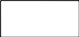
FIGURE 1-1: Double Width and Double Height both disabled

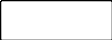
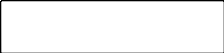
FIGURE 1-2: Double Width enabled and Double Height disabled.


FIGURE 1-3: Double Width disabled and Double Height enabled.

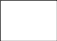

FIGURE 1-4: Double Width enabled and Double Height enabled.
When creating buttons for the POS Screen, regardless of the function selected for the button, you will be able customise it however you like.
When a button has been selected, the middle-left of the screen will show a “Button Appearance” area.
A preview of what the button will look like is displayed within this area.
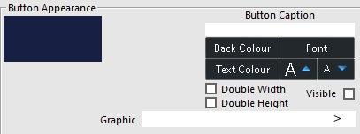
FIGURE 1-5: An example of the Button Appearance section that appears when creating and configuring a button.
The left-hand side of the Button Appearance section shows a preview of how the button will appear.
This section will generally be filled in automatically depending on the function used.
It is possible to change the caption to be whatever you wish.
Carriage Returns can also be used in a button caption to get the text in the button to move to the next line.
The character that Idealpos will treat as a Carriage Return is the tilde symbol "~".
The below is an example of the tilde symbol on a button caption.
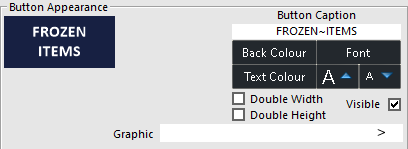
FIGURE 1-6: An example of the tilde symbol "~" in the Button Caption field.
When the tilde symbol is entered, any text that appears after it will appear on a new line.
This is the colour that the button is going to be.
You can select from the 48 pre-defined colours, or select an additional 16 colours using the custom colours grid.
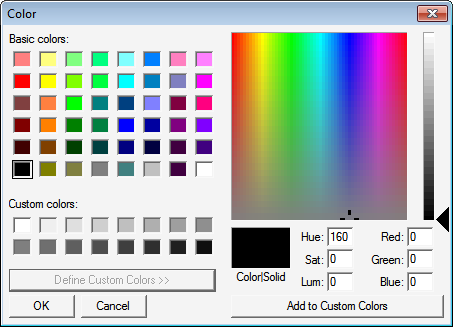
FIGURE 1-7: The Color selector window appears when pressing the "Back Colour" or "Text Colour" buttons.
This is the colour that the text on the button is going to be.
You can select from the 48 pre-defined colours, or select an additional 16 colours using the custom colours grid.
This allows you to change the font of the selected button.
You can change the font, font style and size.
Each button can be unique.
Some buttons you will want to use the same style and size to allow them to stand out, buttons that link to grids and menus for example.
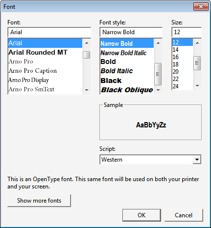
FIGURE 1-8: The Font selector window appears when pressing the "Font" button.
These two arrows allow you to change the size of the font on the selected button.
This checkbox determines if the button will be visible on the POS Screen.
If not selected as visible, the button will present as black background.
This checkbox will make the button twice the width.
It can be used on its own or in conjunction with Double Height.
This checkbox will make the button twice the height.
It can be used on its own or in conjunction with Double Width.
If you want you can add a graphic to a button.
It is a good idea to decide on the button size and make the graphics you want to use the same size.
It is also a requirement to store the images in the Pictures folder of Idealpos.
The Pictures folder is typically available in the following location, but this may vary based on the Operating System:
C:\ProgramData\Idealpos Solutions\Idealpos\Pictures\
1024 x 768 Resolution
Standard Button Size – 110 x 52 pixels
Double Width – 223 x 52 pixels
Double Height – 111 x 105 pixels
Double Height/Width – 223 x 105 pixels
Numpad- 54 x 39 pixels
Numpad Double Width- 110 x 39 pixels
Numpad Double Height- 54 x 79 pixels
Numpad Double H/W- 110 x 79 pixels
1024 x 600 Resolution
Standard Button Size – 111 x 52 pixels
Double Width – 223 x 52 pixels
Double Height – 111 x 105 pixels
Double Height/Width – 223 x 105 pixels
Numpad – 54 x 39 pixels
Numpad Double Width – 110 x 39 pixels
Numpad Double Height – 54 x 79 pixels
Numpad Double H/W – 110 x 79 pixels
1280 x 800 Resolution
Standard Button Size – 138 x 52 pixels
Double Width – 278 x 52 pixels
Double Height – 138 x 105 pixels
Double Height/Width – 278 x 105 pixels
Numpad- 86 x 39 pixels
Numpad Double Width- 174 x 39 pixels
Numpad Double Height- 86 x 79 pixels
Numpad Double H/W- 174 x 79 pixels
1366 x 768 Resolution
Standard Button Size – 111 x 52 pixels
Double Width – 223 x 52 pixels
Double Height – 111 x 105 pixels
Double Height/Width – 223 x 105 pixels
Numpad – 110 x 39 pixels
Numpad Double Width – 222 x 39 pixels
Numpad Double Height – 110 x 79 pixels
Numpad Double H/W – 222 x 79 pixels
1920 x 1080 Resolution (sizes recorded using a POS Terminal with Windows scaling set to 125%)
Standard Button Size – 128 x 59 pixels
Double Width – 257 x 59 pixels
Double Height – 128 x 120 pixels
Double Height/Width – 257 x 120 pixels
Numpad – 127 x 58 pixels
Numpad Double Width – 256 x 58 pixels
Numpad Double Height – 127 x 118 pixels
Numpad Double H/W – 256 x 118 pixels
1920 x 1080 Retail Resolution (sizes recorded using a POS Terminal with Windows scaling set to 125%)
Standard Button Size – 128 x 59 pixels
Double Width – 257 x 59 pixels
Double Height – 128 x 121 pixels
Double Height/Width – 256 x 121 pixels
Numpad – 68 x 59 pixels
Numpad Double Width – 139 x 58 pixels
Numpad Double Height – 68 x 119
Numpad Double H/W – 138 x 120 pixels
This function allows you to create more than one Stock Item button at a time.
It is best to decide on the buttons appearance before using this function.
If you select a range of items that is greater than the buttons available, any existing buttons will be overridden.
If the range of buttons exceeds the amount of buttons remaining on the POS Screen, the buttons will be created in the available spaces only.
The buttons will be created Top to Bottom, Left to Right from the button that you originally selected.
Any buttons to the immediate Top and Left of the selected buttons will remain.
To access this function, select any blank button on the POS screen grid, select the "Stock Item" function from the list of functions, then press the "Auto Create Grid" button.
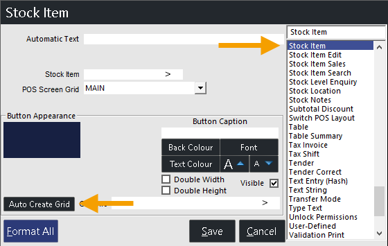
FIGURE 1-9: The "Auto Create Grid" button appears when the "Stock Item" function is selected.
Note - The "Auto Create Grid" button does not appear when using Live Button Programming.
The auto create grid screen will appear, which can be used to specify the criteria for creating the Stock Items on the grid.
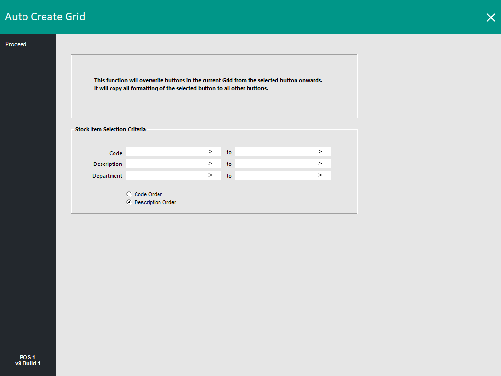
FIGURE 1-10: The "Auto Create Grid" window that appears after pressing the "Auto Create Grid" button.
While it may seem like a good idea to create each button a different colour with different text, it actually makes it harder to use.
Using the same colour and differentiating with shading works much better and is easier on the eyes.
Recommended
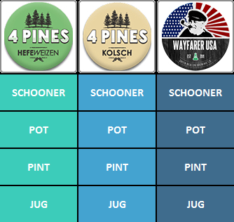
FIGURE 1-11: An example of recommended button colours.
Not Recommended
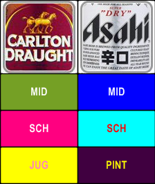
FIGURE 1-12: An example of non-recommended button colours.