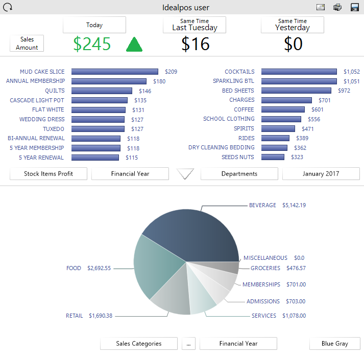
The Dashboard is the area that displays the visual graphs on the Back Office. If required you are able to turn this off so that the Dashboard remains blank. You have the choice of selecting what type of reports can be viewed and the type of graphics used. Any report based on the ‘Top 10 Qty’ selection will not display instruction items. All data that is displayed on the dashboard can be viewed through various standard report formats.
Pressing the buttons at the bottom of the graph will allow you to select which information you want to view from the list of available selections.
You can also press and hold the graph and move up and down to see more data.
While viewing Stock Items, you can press the Stock Item to be shown the Stock Item Enquiry screen for that item.
When viewing Clerks, you can press that graph to be taken to the Journal Enquiry screen.
The last 90 days graph shows sales amounts for the last 90 days and also shows a comparison to the same time last year.
This graph can be dragged by clicking or pressing anywhere within the graph area and moving the cursor left or right.
The ability to zoom in/out by hovering over the last 90 days chart and moving the mouse scroll-wheel up/down is also available to dive further deeper into the data.
The bottom graphs can show exact data by hovering the mouse or pressing on the data points within them.
Press the three dots (…) to display the graphs in different format. Press the button with 3 dots (…) at the middle bottom of the screen to display a pie graph.
Press anywhere on the area around the pie graph to enlarge the graph to the full size of the dashboard.
When the graph has been enlarged, the graph can appear as a 3D Pie Chart by clicking anywhere on the Pie Chart and dragging at the same time.
On devices which use a mouse, click on the Pie Chart and drag the mouse at the same time; the Pie Chart will move as you drag.
On devices which use a touchscreen, press down on the Pie Chart with your finger and drag your finger across the screen; the pie chart will move as you drag.
You may want to move/drag the Pie Chart around to get a better view of your data.
When viewing the enlarged Pie Chart on devices with a scroll-wheel mouse, you can increase/decrease the size of the chart by hovering over the enlarged Pie Chart and scrolling up/down with the mouse scroll-wheel.
Once you have finished using the enlarged graph, close it using the "X" button displayed towards the top-right corner of the Pie Chart graph.
This option can be found on the Miscellaneous Tab.
Show Dashboard – This option will display or remove the graphs from the dashboard area.
It is possible for the dashboard on a POS Terminal to only show data for a specific Location. This will allow your dashboard to not display locations unless you want them to.
Go to Setup > POS Terminals > Modify > Other > Dashboard > enter the selection range of the Locations into the field > Save.