The Dashboard is the area that displays the visual graphs on the Back Office.
The following options and customisations are available for the Back Office Dashboard:
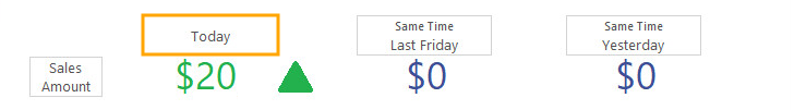
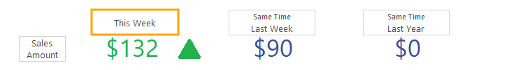
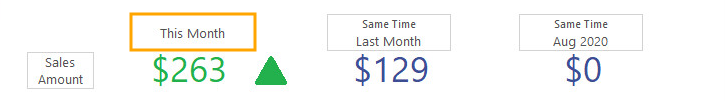
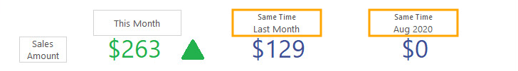
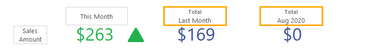
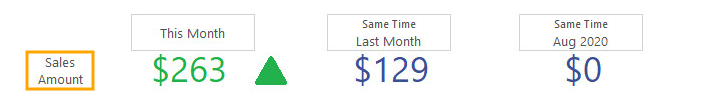
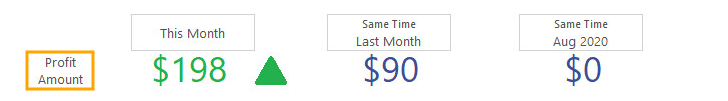
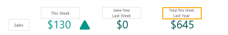
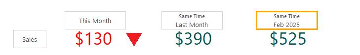
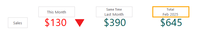
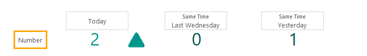
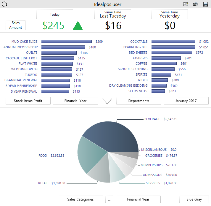
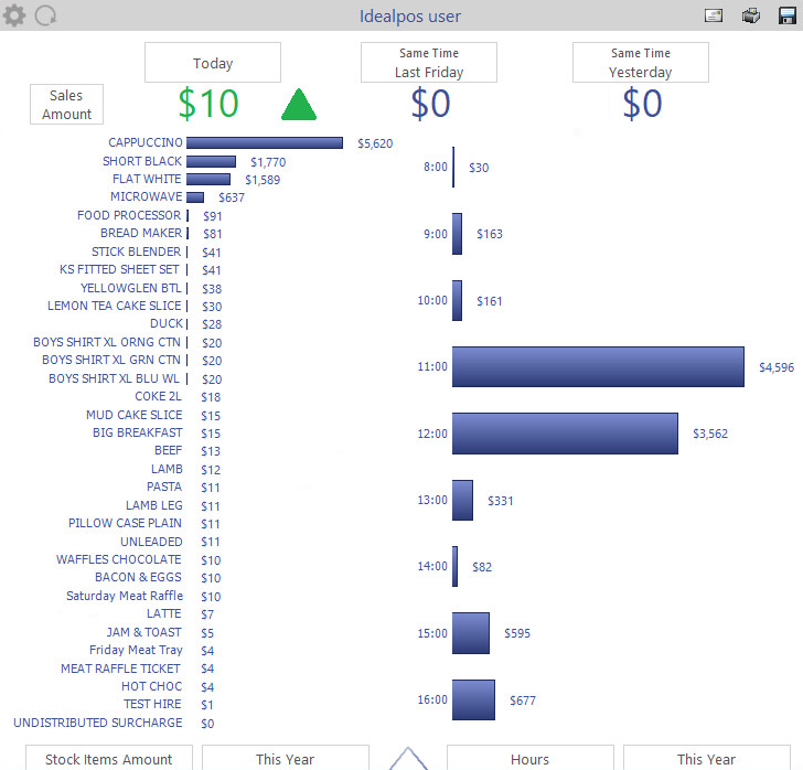
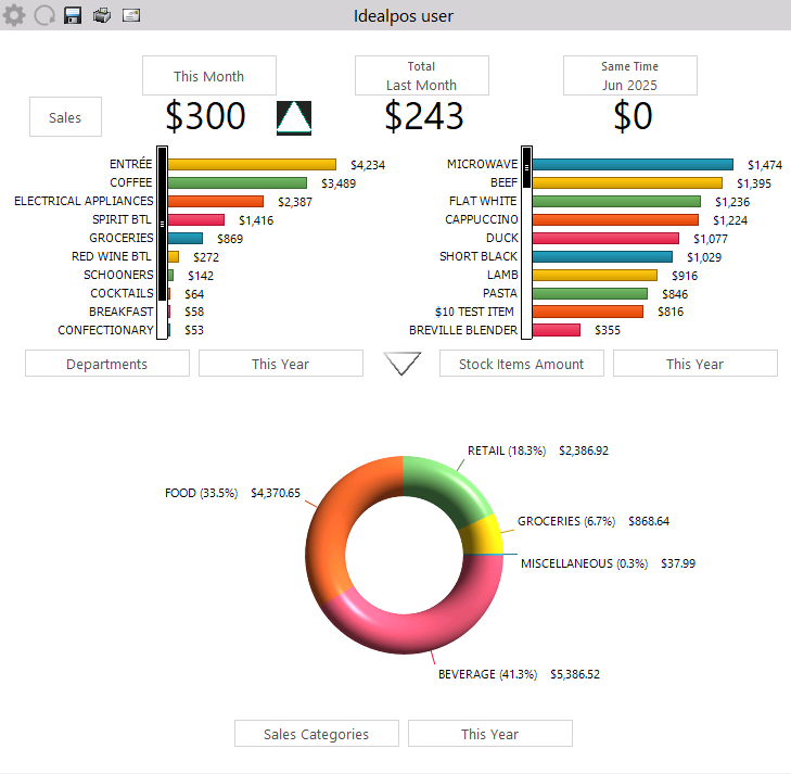
The highest portion of the Dashboard contains three fields which will allow you to compare sales data between three different periods.
Field 1 - Allocated for displaying sales for the current period (either current day, current week or current month; the period is toggled by pressing the button).
Field 2 - Allocated for displaying sales that occurred for the same period last day/week or month (the period shown in the second field will toggle when the first period field is pressed). E.g. If today is Friday and Field 1 has been toggled to show today's sales, Field 2 will show Last Friday.
Field 3 - Allocated for displaying sales that occurred yesterday, as well as sales that occurred in the same period last year.
The options shown in fields 2 and 3 vary depending on the Period selected in the first field (Today, This Week or This Month).
Today - Field 2
When selecting Today in the first field, the options available in the second field are: Same Time Last [Day] (e.g. Wednesday) or Total Last [Day] (e.g. Wednesday).
Today - Field 3
When selecting Today in the first field, the options available in the third field are Same Time Yesterday, Total Yesterday, Same Time This Day Last Year, Total This Day Last Year.
Note - Same Time This Day Last Year and Total This Day Last Year refers to the same day last year, not the same date last year.
E.g. If Today is Wednesday 25th February 2026, the same day last year will be Wednesday 26th February 2025.
This Week - Field 2
When selecting "This Week" in the first field, the options available in the second field are Same Time Last Week, Total Last Week.
This Week - Field 3
When selecting "This Week" in the first field, the options available in the third field are Same Time Last Year, Total This Week Last Year

This Month - Field 2
When selecting "This Month" in the first field, the options available in the second field are Same Time Last Month, Total Last Month.
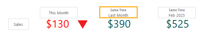
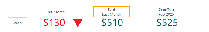
This Month - Field 3
When selecting "This Month" in the first field, the options available in the third field are Same Time [Current Month Name] [Last Year's Number], Total [Current Month Name] [Last Year's Number].
E.g. If the current month is February 2026, the options will show "Same Time February 2025" and "Total February 2025".
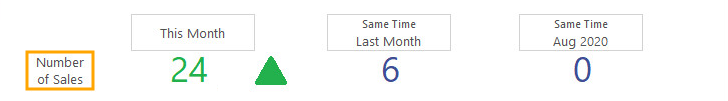
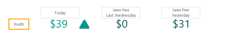
Sales/Profit/Number of Sales
The type of information shown in each of the three period fields outlined above can be toggled by pressing the button located on the far-left side of these fields. This button will toggle the type of data shown in all three period fields at the same time.
The type of data that can be displayed in these fields is outlined below (the currently selected period will be displayed on the toggle button):
Sales - This is amount of sales expressed as a currency value for the currently selected period.
Profit Amount - This is the profit amount expressed as a currency value for the currently selected period. The profit shown here takes into account the taxes and cost of items, leaving you with the actual profit that was made.
Number of Sales - This is the count on the number of sales or transactions that have taken place in the currently selected period.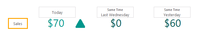
The top portion of the Back Office Dashboard displays two sets of Bar Graphs; one on the left-hand side of the screen and the other on the right-hand side of the screen. These two sets of bar graphs can be used to display two different sets of data, or you can use these two sets of bar graphs to compare the same type of data over two separate periods.
The data that is represented by each set of bar graphs can be controlled by pressing two buttons below each bar graph.
The first button (left-hand side button) controls the type of data represented (Sites, Locations, Sales Categories, Hours, Departments, POS Terminals, Tenders, Stock Items Amount, Stock Items Quantity, Stock Items Profit, Customers, Clerks).
The second button (right-hand side button) controls the period of time that the data is being represented for (Financial Year, This Year, Today, individual months).
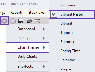
The Colours that are used to represent the Bar Graphs are inherited from the Chart Theme selected via the Settings Cog icon > Chart Theme.
Any report based on the ‘Top 10 Qty’ selection will not display instruction items.
All data that is displayed on the dashboard can be viewed through various standard report formats.
The arrow button located half-way down the Back Office Dashboard can be pressed to expand the area for displaying bar graphs:

The Bar Graphs will occupy the entire Back Office Dashboard.
Pressing the buttons at the bottom of the graph will allow you to select which information you want to view from the list of available selections.
You can also press and hold the graph and move up and down to see more data.
While viewing Stock Items, you can press the Stock Item to be shown the Stock Item Enquiry screen for that item.
When viewing Clerks, you can press that graph to be taken to the Journal Enquiry screen.
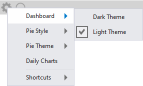
Three Dashboard Themes are available and can be used to change the appearance (Dark Theme or Light Theme).
To select the Dashboard Theme, press the Cog icon located towards the top-left side of the Dashboard, then from the Dashboard menu, select the required theme.
The currently selected theme will be marked with a checkbox.
Selecting a theme will only apply it to the current terminal and all Users of that terminal will see the same theme.
Changing the Dashboard Theme will not apply it to all networked terminals.
Each theme example shown below is displayed in the menu order - Dark Theme, Light Theme.


The type of data conveyed within the Pie Chart can be chosen by pressing the buttons below the Pie Chart.
The first button on the left-hand side is used to toggle the type of data being shown in the Pie Chart (e.g. Sites, Locations, Sales Categories, Hours, Departments, POS Terminals, Tenders or Clerks)
The second button on the right-hand side is used to toggle the period of time that is conveyed in the Pie Chart (e.g. Financial Year, This Year, Today or individual months).
In addition to selecting the type of data shown in the Pie Chart, the way the Pie Chart is displayed on the Dashboard can be customised from the Dashboard cog icon.
Press the Cog icon located towards the top-left side of the Dashboard, then select either Pie Style or Pie Theme. These menus are outlined in further detail below:
Pie Style - The Pie Style menu contains four Pie Chart Styles - Flat Pie, 3D Pie, Donut Pie and Torus Pie. Examples of each of these Pie Chart Styles are shown further below in the same order (Flat Pie, 3D Pie, Donut Pie and Torus Pie).
When viewing the 3D Style Pie Charts (3D Pie, Donut Pie or Torus Pie), the Pie Chart can be rotated by clicking on it and dragging the mouse cursor.
On devices which use a mouse, click on the Pie Chart and drag the mouse at the same time; the Pie Chart will move as you drag.
On devices which use a touchscreen, press down on the Pie Chart with your finger and drag your finger across the screen; the pie chart will move as you drag.
You may want to move/drag the Pie Chart around to get a better view of your data.
When viewing the enlarged Pie Chart on devices with a scroll-wheel mouse, you can increase/decrease the size of the chart by hovering over the enlarged Pie Chart and scrolling up/down with the mouse scroll-wheel.


Pie Theme - The Theme menu contains numerous colour options: Victorian, Vibrant Pastel, Vibrant, Tropical, Summer, Spring Time, Rainbow, Purple, Primary Colours, Postmodern, Photodesign, Pastel, Office, Orange Green, Nature, Natural, Impressionism, Illustration, Harvest, Green Brown, Green Blue, Green, Gray, Four Colour, Fire, Earth Tone, Danville, Caribbean, Cappuccino, Blue Gray, Blue.
This option only appears on lower resolution screens that cannot support displaying both the Daily Charts and the Pie Charts at the same time.
When the Pie Chart is being displayed on the Dashboard, the Daily Chart option will appear in the menu.
When the Daily Chart is being displayed on the Dashboard, the Pie Chart option will appear in the menu.

The Daily Chart menu options (Daily Style and Daily Period) appear after the Daily Charts option has been selected from the cog menu.
Options that are available in these two menus control the way the Daily Charts are displayed.
Daily Style - The Daily Style menu contains three Daily Chart Styles - Line Chart, Bar Chart and Area Chart.
The last 90 days graph shows sales amounts for the last 90 days and also shows a comparison to the same time last year.
This graph can be dragged by clicking or pressing anywhere within the graph area and moving the cursor left or right.


The ability to zoom in/out by hovering over the last 90 days chart and moving the mouse scroll-wheel up/down is also available to dive further deeper into the data.
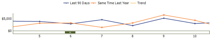
The graphs can show exact data by hovering the mouse or pressing on the data points within them.

Daily Period - The Daily Period menu contains three different Period Types - Monthly, Last 24 Hours/Last 7 Days and Average Weekday/Week.

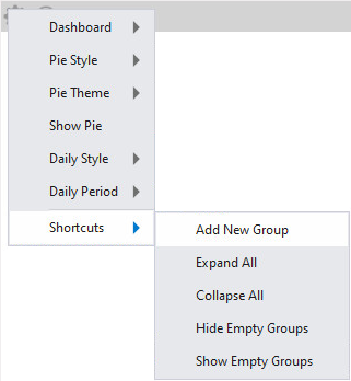
The Shortcuts menu option contains three functions:
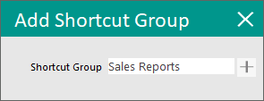
Add New Group - This option allows a new Shortcut Group to be created.
When selecting this option, you will be prompted to enter a Shortcut Group name. Pressing the "+" button will create a Shortcut Group for the entered name.
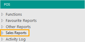
Shortcut Groups that are created will appear on the left-hand side of the Dashboard.
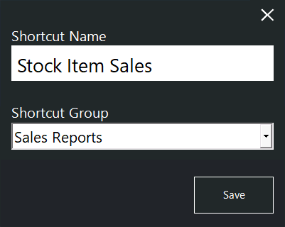
Once Shortcut Groups have been created, shortcuts can be saved or moved into those groups.
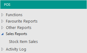
To save a report shortcut into a Shortcut Group, simply press the "S" button on the top-right corner of a report, then enter a Shortcut Name and select the required Shortcut Group from the Shortcut Group dropdown menu.

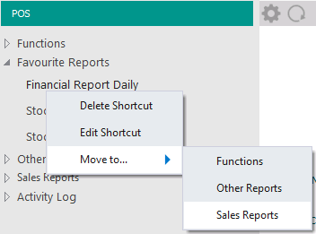
Shortcuts that already exist can be moved to any Shortcut Group by right-clicking on an existing shortcut and selecting the required Shortcut Group within the "Move to..." menu.
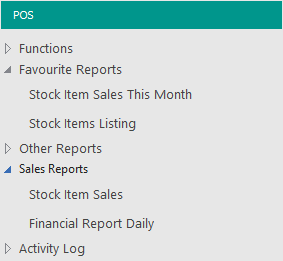
The below example shows the "Financial Report Daily" shortcut being moved from the "Favourite Reports" group into the "Sales Reports" Shortcut Group.
Shortcuts and Shortcut Groups can be deleted by right-clicking on them within the left-hand side Shortcut menu and selecting the "Delete Shortcut" option.
If a Shortcut Group is deleted via the Delete Shortcut option, the Shortcut Group must contain no Shortcuts; attempting to delete a Shortcut Group that still contains shortcuts will display a prompt "Cannot delete Shortcut Groups with Items".
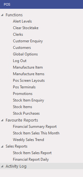
Expand All - This option will expand all the Shortcut Groups so that all the shortcuts contained within each group are visible.
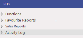
Collapse All - This option will collapse all the Shortcut Groups so that all the shortcuts contained within each group are hidden/collapsed.
Hide Empty Groups/Show Empty Groups - This option will show or hide all Shortcut Groups that do not contain any Shortcuts.
Shortcut Groups are Global (they appear on all sites in a multi-site environment).
Shortcuts are site-specific (Shortcuts will only appear at the site in which they've been created).
When a user at a Site creates Shortcut Groups and adds Shortcuts to them, other sites that are part of the multi-site environment will only see empty Shortcut Groups.
The other Sites can use those Shortcut Groups by saving their own Shortcuts to them. If the Shortcut Groups that were created at other sites are not required, they can be hidden by selecting the option to Hide Empty Groups.
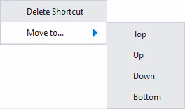
Right-clicking on a Shortcut Group on the left-hand side of the Back Office Dashboard will display the following options:
Delete Shortcut - This will delete the Shortcut Group. When deleting a Shortcut, Idealpos will display a confirmation prompt "Are you sure you wish to Delete this Shortcut?". In order to delete a Shortcut Group, it must contain no Shortcuts. Attempting to delete a Shortcut Group that still contains shortcuts will display a prompt "Cannot delete Shortcut Groups with Items."
Move to... - This menu option will display a list of options that enable the position of the Shortcut Group to be moved up or down on the Back Office Dashboard. The options available are:
Top - Moves the Shortcut Group to the very top of the list.
Up - Moves the Shortcut Group up one line.
Down - Moves the Shortcut Group down one line.
Bottom - Moves the Shortcut Group to the very bottom of the list. Note that when moving to the bottom, the Activity Log will always be the last option shown at the bottom of the list.
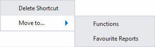
Right-clicking on a Shortcut on the left-hand side of the Back Office Dashboard will display the following options:
Delete Shortcut - This will delete the Shortcut. When deleting a Shortcut, Idealpos will display a confirmation prompt "Are you sure you wish to Delete this Shortcut?".
Move to... - This menu option will display a list of Shortcut Groups that the Shortcut can be moved to.
The below example shows two Shortcut Groups in the "Move to..." menu. This will differ depending on the Shortcut Groups that have been created in your system.
This option can be found on the Miscellaneous Tab.
Show Dashboard – This option will display or remove the graphs from the dashboard area.

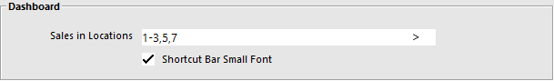
It is possible for the dashboard on a POS Terminal to only show data for a specific Location. This will allow your dashboard to not display locations unless you want them to.
Go to Setup > POS Terminals > Modify > Miscellaneous Settings > Dashboard > Enter the selection range of the Locations into the field > Save.